HTRC homepage redesign
HTRC Analytics is the primary platform HTRC users interact with, but, as this case study highlights, prior to the initiation of this research it had not been significantly updated since 2015.
This case study will primarily demonstrate an iterative design process, and highlight the evolution between first design concepts to final production-level design and implementation.
The problem
In 2021, a usability audit was conducted across the entirety of the HTRC Analytics site (see the details of that project here). HTRC user personas and journey maps were created, and librarians, researchers, and students were interviewed and tested to help identify any pain points experienced as they navigated through the site. Of the findings gathered from that project, redesigning the HTRC Analytics homepage was top among them.
Users complained that the homepage made it difficult to understand where to go and what they could do within the site. The homepage lacked an informative, intuitive flow that they could follow, and therefore impacted the findability of the tools and information they needed to complete their tasks, whether that be creating datasets (called ‘worksets’ at HTRC), downloading data into a virtual machine (called a ‘data capsule’), or using point-and-click text analysis tools. The original homepage had been designed for advanced technologists, but was now outdated, confusing, and intimidating for newcomers and beginners of text analysis methodologies.
My role
As the associate UX designer at HTRC, I led all quantitative and qualitative studies related to this project, as well as the iteration of design ideas to achieve the most usable, intuitive design solution. I worked with HTRC’s associate directors in the Cyberinfrastructure and Outreach and Education units to come up with custom solutions, as well as a small team of software engineers to put the designs into action. I also implemented the final design into the frontend code using React.js.
First attempts
After the 2021 interviews and user tests, I hypothesized that some major user journey blocks were preventing users (particularly beginners of text analysis) from understanding and maneuvering through the site successfully and finding the best tools for their particular research or school projects. Problems on the homepage included opaque and confusing images depicted beneath the ‘Featured Services’ header:

Image: Top of the HTRC Analytics homepage, depicting geometrical graphics that do not correlate to tools built and hosted by HTRC
…as well as the random order and poor color contrast of tools and services presented in the global navigation:

Image: HTRC Analytics global navigation presenting arbitrary order of tools and services
Both of these issues, I believed, hampered users’ ability to understand the natural flow of the site, and caused them to feel overwhelmed and unsure of where they should begin. From the UX audit, I had some preliminary user data I could use to guide the creation of three initial wireframe designs, causing me to replace the opaque images with more modern icons and rearranging the order of the information presented on the homepage. All three designs changed the order of global navigation, intended to start with data and move into different kinds of text analysis tools the data could be analyzed with to model a natural workflow for new users. I also added a navigational link to the HathiTrust Digital Library to create a more findable connection between the two primary HathiTrust organizations.

Wireframe design 1
Image: Initial design concept depicting an image carousel highlighting the actual tools, data, and services on the site

Wireframe design 2
Image: A second design, using iconography to help provide users a conceptual model of tool affordances provided by the site

Wireframe design 3 (top)
Image: A third homepage design, with the top portion matching Design 2 and the bottom providing text about the site

Wireframe design 3 (bottom)
Image: Bottom portion of Design 3; text describes where the textual data comes from and how to start using HTRC Analytics
When we showed these designs to users, we learned that the simple icons were more useful for understanding how to move through the site from beginner-friendly to more advanced tools. We also learned that we needed to better showcase our beginner-friendly tools so that first-time visitors feel welcomed and unintimidated.
Second attempt
With these new user findings in mind, I wanted my next designs to better marry iconography with text to provide users the context they needed to understand the site’s affordances as fast as possible. Wireframe Design 4 continues to highlight graphical icons for conceptual model assistance, along with descriptive text beneath each categorized icon card to elaborate further on a standard user journey. The bottom of the homepage keeps some basic statistics about the HathiTrust Digital Library textual data.
Wireframe design 4 (top)
Image: Fourth wireframe using larger, even simpler icons on top of descriptive text so users understand where to start on their journey, and what they can do, from beginner tools to more advanced

Wireframe design 4 (bottom)
Image: Bottom of wireframe design 4, shows basic statistics about the HathiTrust Digital Library, like current volume count and number of book titles
When I tested this design with users, they commented favorably on the more purposeful design of the icons and their descriptions, but weren’t as impressed by the table of statistics at the bottom of the page, complaining that it was not immediately eye-catching or interesting. They also wanted to be shown some of the actual beginner-friendly tools themselves, and have it made clear where those tools exist. They also wanted to see more beginner-friendly resources highlighted.
Third attempt
The next two wireframe designs incorporated an image of the beginner-friendly tool Bookworm+HathiTrust. This tool is extremely useful for first-time users because they do not need to be account holders or know how to code in order to successfully use the visualization tool. I also wanted to change the HathiTrust stats table to a visualization of the collection as well, to help users more effortlessly grasp some key details of the scale of the digital library’s holdings.

Wireframe design 5 (top)
Image: ‘Featured Services’ now showcases an image of the Bookworm+HathiTrust visualization tool that demos word usage across the corpus over time. This is a beginner-friendly tool.

Wireframe design 5 (middle)
Image: Icons have been condensed into two categorical cards to show user progression from getting data, analyzing data, and utilizing advanced tools that require coding knowledge, like the data capsule environment

Wireframe design 5 (bottom)
Image: Bottom of wireframe removes previous library stats table and replaces it with brief descriptive text connecting the HathiTrust Digital Library to HTRC Anaytics and shows a helpful pie chart of the holdings
After internal discussions with the Outreach and Education team, I created a version of this wireframe design using an updated global navigation menu. There were simply too many parent labels crowding up the space, and the relationship between categories remained unclear. A mega menu design was used in a separate wireframe called v5.1 so that testers could observe and comment upon both designs. This was the only design difference between v5.0 and v5.1.
Wireframe design 5.1 (global navigation)

Image: v5.1 global navigation featured; only 3 parent categories are needed when using the mega menu design: Data, Tools, and Learn and Support
When users were shown these two designs, they overwhelmingly appreciated the top-level feature of the Bookworm+HathiTrust tool, as well as the simplified mega menu organization. However, it was brought to our attention that we had been neglecting an important concept that is foundational to data use at HTRC, which is the ‘nonconsumptive use policy’ – librarians in particular pointed out that this was a concept worth communicating to users as early as possible, even from the homepage, just so they acquire a better understanding of the type of data formats HTRC offers, and why. They also desired more up-front contact information, as well as getting the footer categories to mirror the global navigation order of sub-categories (i.e., Worksets, Algorithms, Datasets, etc.).
The final push
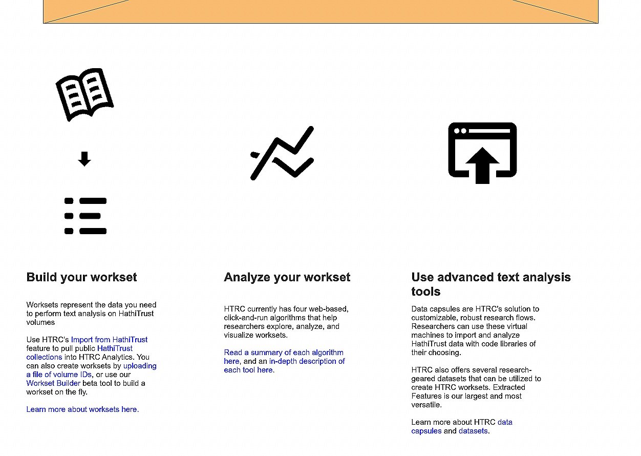
My final designs took into consideration the latest feedback from both users and staff members (staff members across all HTRC units were interviewed during an internal listening tour I conducted for the homepage redesign, and their concerns were noted and considered; additionally, I led a wireframe workshop with the Outreach and Education team during the version 6 design process). The mega menu was retained, text was condensed into links where possible, and information about HTRC data was pushed to the top of the page (including brief but essential information about the nonconsumptive use policy). Images, icons, and text were chunked and organized to help mirror a flow of moving through the site, and more overt links to beginner-friendly resources, like to a “New to HTRC?” page were added. Additionally, I pulled in the specific HathiTrust Digital Library branding colors, logos, and fonts, to help indicate the connection between the two platforms. All these changes were intended to provide users with necessary, but brief information via grouped text (with appropriate headers), complimented with helpful images as either pictures or icons. Additionally, these changes help demonstrate a logical progression through the site – from getting data, to running beginner-friendly, no-code-needed tools, to downloading data into the advanced data capsule environments.

Wireframe design 6 (top)
Image: Top of v6 wireframe design, with data and nonconsumptive use featured as introductory concepts to the site

Wireframe design 6 (middle)
Image: Middle section of homepage, showing a pie chart of HathiTrust languages and a information box linking first-time users to a New to HTRC? page
Wireframe design 6 (bottom – 2 images)


Images: Bottom sections of homepage, showing the Bookworm+HathiTrust tool, as well as icon cards with links buttons to appropriate pages throughout the site
After some more internal discussion between the cyberinfrastructure and outreach teams, we decided to reduce the height of the homepage banner and add an information box at the very top of the page that briefly describes HTRC Analytics. The homepage link text was also replaced with the most up-to-date HTRC logo.
Wireframe design 6 (global navigation)

Image: Slimmed down banner space and HTRC Analytics description
The final product in production
After reviewing wireframes with internal stakeholders and receiving feedback on the design, the final front-end code was pushed into production. Note that previous link buttons have been changed to simple text links for accessibility purposes.

Image: HTRC Analytics homepage (top) showing global navigation with white background and orange border; previous orange buttons in right text column are now text links

Image: HTRC Analytics homepage (middle 1); updated pie chart with visible labels

Image: HTRC Analytics homepage (middle 2); ‘Explore with Bookworm’ link button removed; image header and image are a clickable link to the tool

Image: HTRC Analytics homepage (bottom); orange link buttons have been replaced with link text
Please note: Not only did I lead all UX research and design phases, I also was responsible for creating the front-end code for the design and readying this code for production using React.js.
Reflections
Challenges:
The most difficult aspect of this project has been its scale. The homepage is powerful and important real estate where HTRC must welcome, inform, and garner trust from our user base. As a UX team of one, I have led all phases of this project which includes: gathering and analyzing data; brainstorming solutions; garnering stakeholder buy-in; conducting design iteration; leading internal communication and team-building activities; project planning; and implementing final changes into the React frontend code base. It is a lot of work for one person to do (even with my collaborative relationships across both the cyberinfrastructure and outreach teams), and has extended the project deadline more than once. But I would prefer the project take longer to complete knowing I have been diligent in each step along the way, and having meaningful conversations with my colleagues as well) rather than rushing to push out an inferior design.
Additionally, through this project we discovered that the Play framework HTRC Analytics operates on required several React version upgrades in order to ensure that I would be able to build out a mega menu component. Myself and the cyberinfrastructure team coordinated upgrading the entire frontend from React 15 to 18, which also slowed down my progress for coding the front end.
What Did I Learn?
The research I conducted for this project revealed several ongoing issues that HTRC will need to address either long term or in the more immediate future:
HTRC’s terminology remains confusing for our users
‘Algorithms’ is vague and could mean a wide variety of tools/computational methods
‘Workset’ vs. ‘dataset’ consistently confuses users because the site currently does not successfully delineate their differences.
‘Data capsule’ is somewhat opaque and we struggle to define this proprietary term to beginner and intermediate users.
During my user tests I learned that tagging tools and resources on the interface as either ‘beginner’, ‘intermediate’, or ‘advanced’ would help signify to users where they should navigate to on the site.
Ordering information in a logical flow for users from the homepage accelerates their ability to form an accurate conceptual model of the site and its offerings.
Creating beginner-centered documentation (like ‘HTRC Glossary’ and ‘New to HTRC?’ pages) and linking those from either the homepage or the global navigation will help first-time users of the site know where they should begin in their journey.
Brand consistency (like colors, fonts, and logos) between the HathiTrust Digital Library and HTRC Analytics helps build intuitive connections for users as they go back and forth between the sites.
Users have indicated that they would like HTRC to do more to help bring digital humanities scholars, students, and librarians together since the larger community is scattered, making it difficult to form communities of practice. This observation is beyond the scope of this project, but it is interesting to think about as HTRC matures and moves into the future of academic text analysis.
Overall, this project has provided me with many meaningful opportunities to make HTRC Analytics work better for our users, particularly beginners and intermediate text analysis researchers. Moving forward, I would like to address HTRC’s terminology, website WCAG/WAI-ARIA compliance, and community-building outreach options.